 1)Criticism Process -
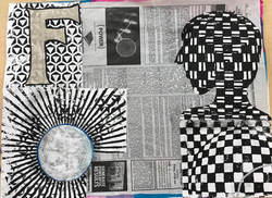
Describe the artwork: List the things that you see in the artwork. Analyze the artwork: list art elements and design principles. Interpret the artwork: what is the theme or mood of the artwork. Judge the artwork: what do you think of the artwork. 2)Critique an older piece - For my critique I'm doing my mixed media piece because that is my most creative piece. My piece is mostly black and white all around because of the contrast of both of the colors towards each other. The word I had to use was "mind" , so I used different sections of the piece to represent different trains of thought. The F in the top left corner represents friends and family. The ball in the bottom left represents sports and other games, while the head shape represents thought and creativity. The reason I used the newspaper in the background is to represent people's thoughts and ideas that they can put out to the public. The theme and mood of the piece is putting your mind to your ideas and using creativity. I think that I did a good job on representing different things in the piece, and did a good job with the colors and the look. I think I could have used some more mediums on the main part and added some words or pictures. I overall think I did a good job but could have gone much deeper into than what I did. 3) Pick three questions - 1) What is art? Art is any form of expressing your feelings and emotions through a piece of work. It is a way to speak your mind through creation and work. Anytime you use a certain platform to let others know what your feeling or to get a message out it can be considered a form of art. Art can be visual, musical, or physical etc. 2) What is the point of this class? What did you get from taking it? I think that the point of this class is to introduce someone interested in art to all of the different forms and mediums to see if they find anything that they like or would like to continue to do in the future. I learned a lot about all of the different kinds of art that I didn't even know about before. There are many things that I learned about how to do certain things and how to use different techniques. Overall the class made me gain more interest in art and gave me different ideas for what I can do. 3) Do you feel like the illustration Fridays helped you brainstorm for larger projects? I think that the illustration Fridays helped me a lot with coming up with something when you are given a specific thing or word to work with. Overall the illustrations were a good addition to what we were working on that week.
0 Comments
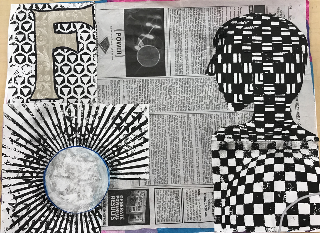 For my piece I used 5 different mediums. I used the colors blue, purple, and some greens on the tissue paper because they are mellow and calm colors. The newspaper went on top of the tissue paper and is the background in my piece. I used the colors black and white because they are opposites and make each other stand out more. Finally I used the paper with different patterns to represent different parts of my piece.
The word I was given was “Mind” which I portrayed with the different mediums. The newspaper represents people’s different opinions and ideas that are put out to the public. The different patterns on the papers represent the different sections of someone’s mind, like how the F represents family and friends , and the ball represents sports and games. The cut out head shape is he main part of the piece which just represents the mind and creativity. 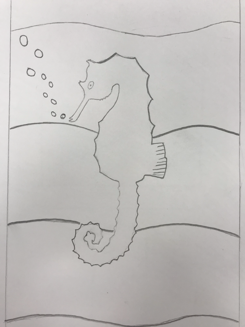 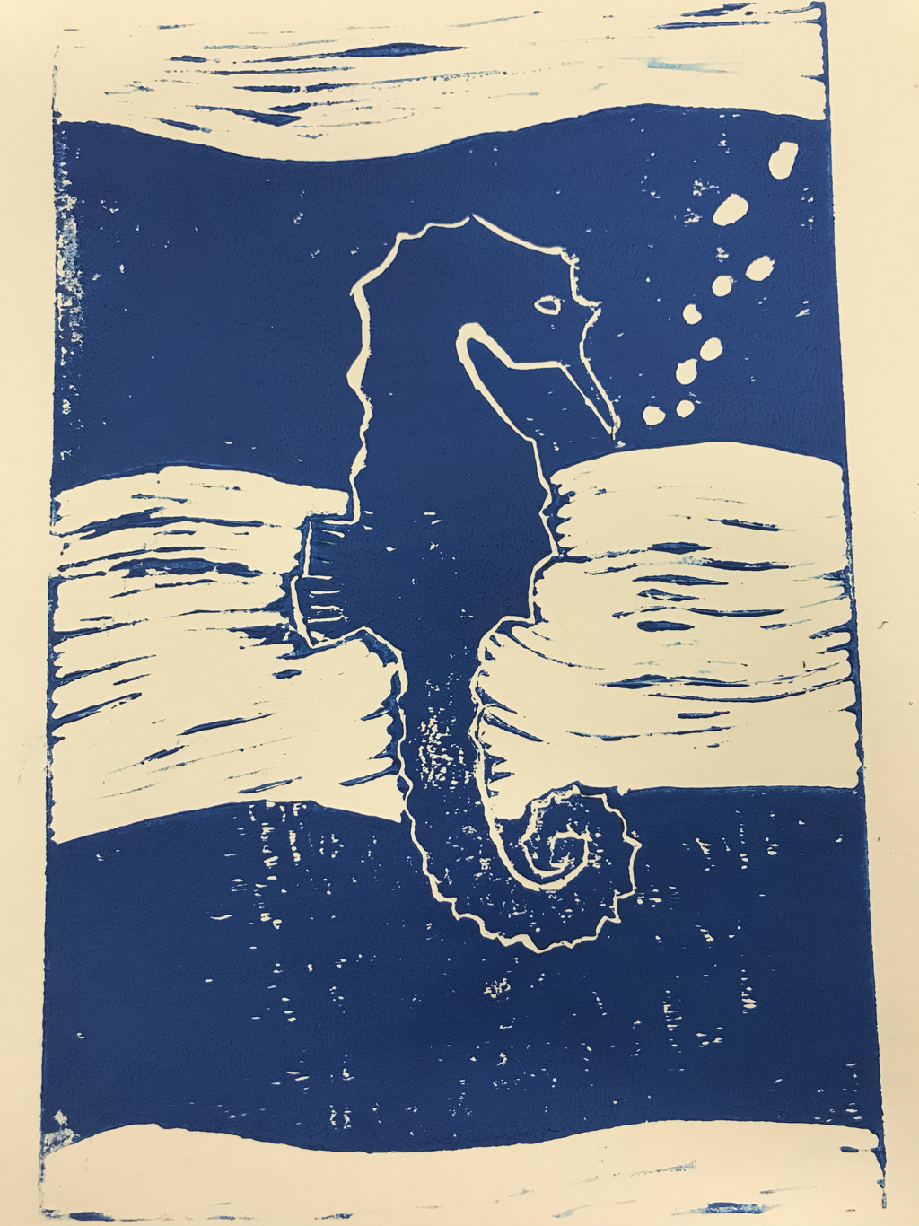 1) This piece shows the theme of “line” because of the different values,depth, and sizes of the lines that I used.
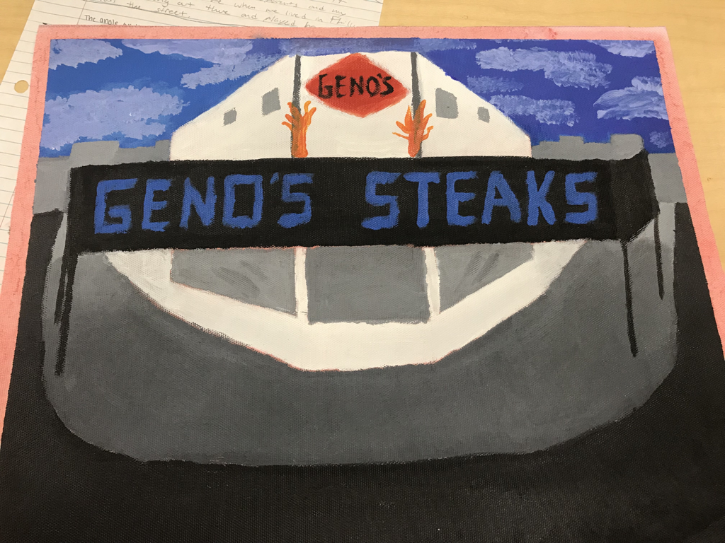
2) I think that this piece was successful because of the details of the lines that showed with the final product. If I could change one thing it would be to clean up the lines around the Seahorse so it would almost pop out of the piece. Finished piece 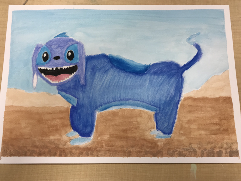 Most helpful warm up  Mind Map 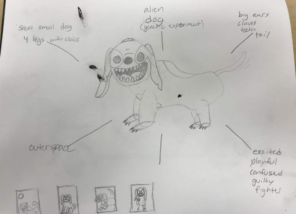 For my painting I recreated the character Stitch who is originally a small blue koala from outer space. My design differed from the original design because I made it more dog like rather than a koala like creature. I used the water color by doing layers and layers of it and being patient. The colors were much different at one point but I just kept adding layers to get more clear and deep shades. If I were to give any advice to someone starting water color it would be to just be patient with letting the paint dry so the color will come out much better and clean. 1) I did a painting of Geno’s Steaks in Philadelphia, Pennsylvania. Geno’s is a restaurant in South Philly that I used to hang out at with my Aunt and sometimes my parents. It means something to me because there was always a positive vibe even in a city like Philly. 2) The most challenging part about the picture to me was the perspective and angle that the picture was taken. 3) I think the most successful part about my piece was my skyline in the background and the sky itself . 4) With my piece I started from the back with the sky and worked my way up to the sidewalk and street. With the perspective of the sidewalk getting further away I used some water to help blend the shades of black and grey. I also jabbed the brush lightly on top of the blue sky to make the clouds . Completed Piece 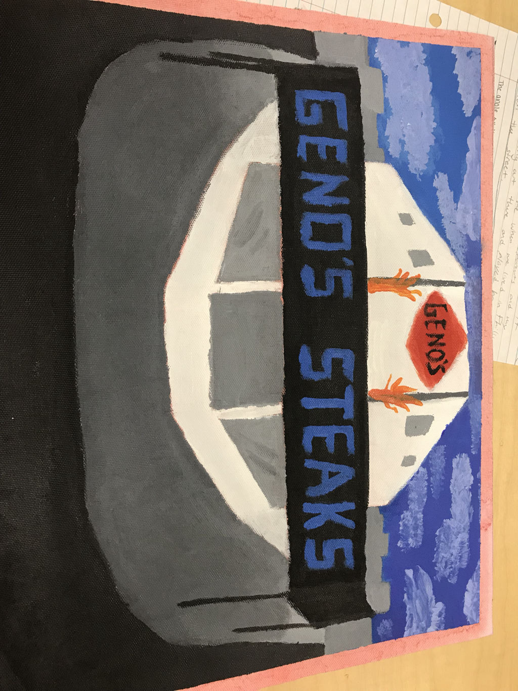 In Progress 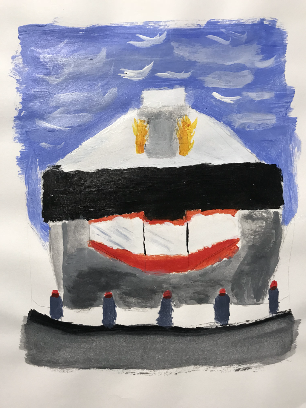 Most Helpful Warm up  Hue Value Scale  Who is your mentor ? Anna W
What kind of art do they make ? Mixed Media Digital Link- annaw-apex-2018.weebly .com What will I gain from this ? What do I want to learn? This will definitely help with my progression through the class and she can teach me how to work with different kinds of art . I would like to learn how to do the mixed media stuff that she does . |
AuthorWrite something about yourself. No need to be fancy, just an overview. Archives
January 2018
Categories |
 RSS Feed
